
TrustScore insights
Designing actionable insights for businesses to manage their Trustpilot rating. ⭐️
TL;DR
💼 Background – The Analytics team at Trustpilot focuses on showcasing insights to businesses regarding how customers percieve their product or service (as it relates with their performance on Trustpilot).
Insights such as how many impressions a widget amassed, the number of reviews received, reply rate, average rating, TrustScore (their overall rating on Trustpilot) and what types of reviews were received helps businesses make improvements. This case study focuses on a project to help businesses better understand their TrustScore.
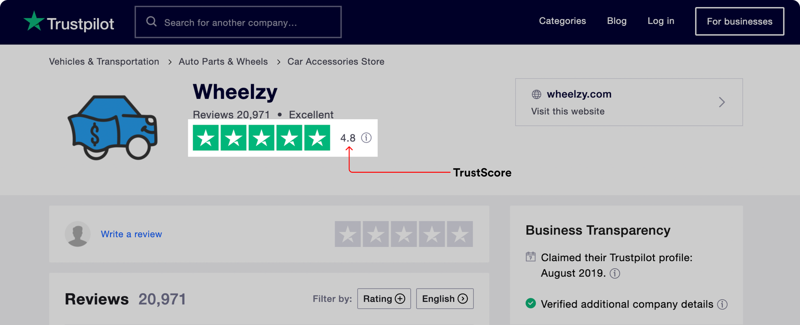
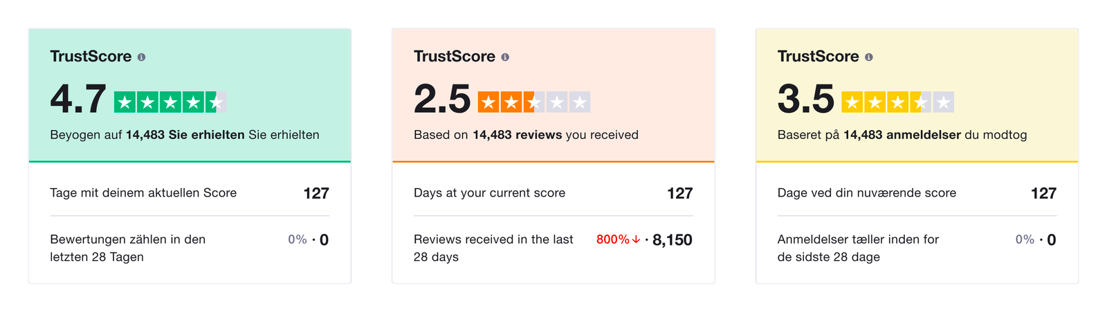
TrustScore visible on a business’ public profile
🏷 The challenge – From research (over 20+ customer interviews), the team discovered that all Trustpilot business users reference their TrustScore (this is the double digit value that appears on their Trustpilot profile) and businesses found this to be the most important metric they reference on Trustpilot. Also, businesses don't exactly understand what components of their workflow on Trustpilot contributes to their TrustScore. One popular misconception is that only reviews distribution makes up the TrustScore, so we set out to fix that.
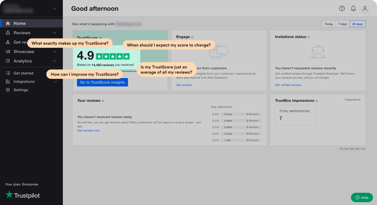
Some questions business users have about their TrustScore
🥇 The solution – Telling a story with the TrustScore as the main character and components that make up the score in supporting roles. The major question to answer is - “How might we help users better understand their TrustScore and give them an overview of its health?”
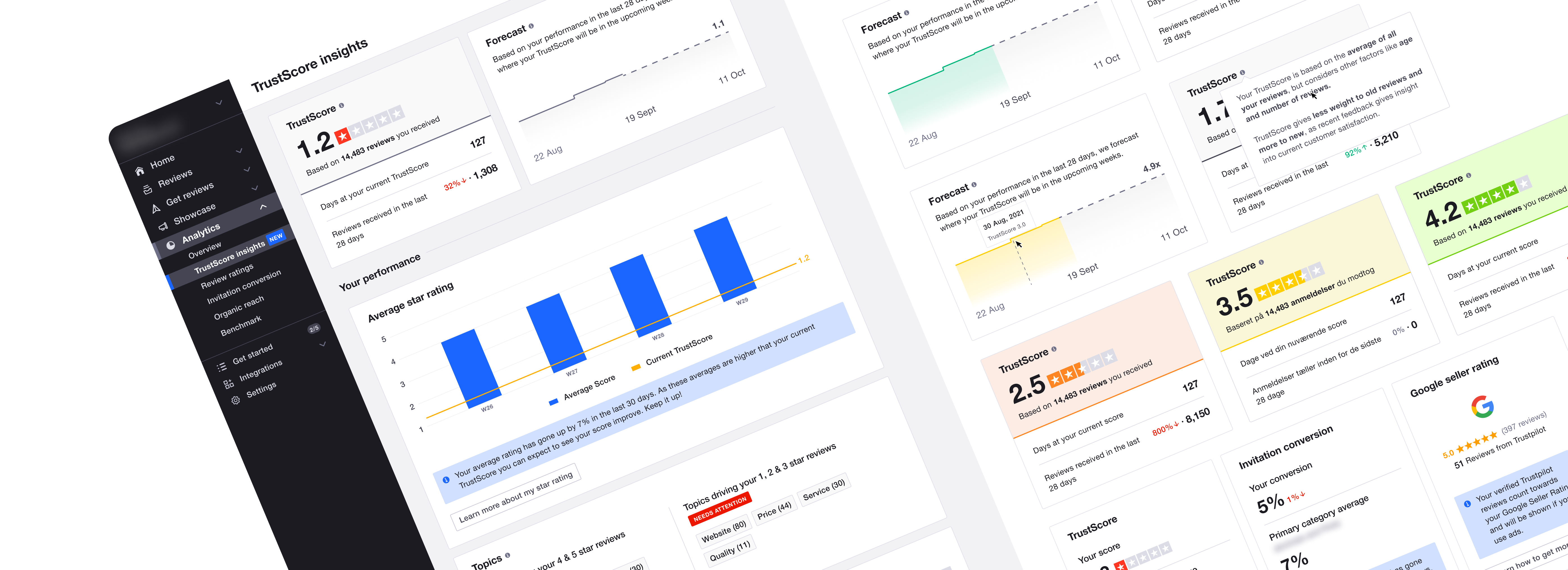
🆕 TrustScore insights page

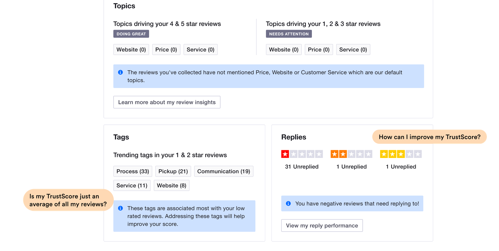
Sections on the page attempting to answering questions businesses have
What better way to explain the concept of a TrustScore than to show how the concept relates with other know features within the Business app? 😄
With the new TrustScore insight page, the goal was not only just to use data to explain the TrustScore but also to empower businesses to make changes from how they engage with customer reviews to how they use features such as tags in reviews to understand trends which could help the business improve.
Now that you have an idea of what this case study is about, let’s dive into the process, my role, how I collaborated with others and the impact of this project! 😄
Deep dive
ROLE IN PROJECT
Product Designer • Ideation, Rapid Prototyping and Visual Design
USER GOAL(s)
• See key insights into the TrustScore and its overall health.
• Manage TrustScore and ultimately gain insights to improve customer experience.
BUSINESS GOAL(s)
• Drive more engagement within the Trustpilot business app.
Hypothesis
A business' TrustScore (Trustpilot rating) is not only based on the positive or negative ratings from their customers but there is a misconception around concept.
🧪 We believe that if we effectively communicate how the TrustScore works, businesses would see more value in their TrustScore and this would lead to more business users engaging with customer reviews and leveraging on the reviews to improve the experience of customers.
Reflecting the lack of value communication is that over 80% of businesses say more transparency about what components impacts the TrustScore would help their business improvement efforts.
Also, based on research, businesses say they would like to reply to bad reviews (1 - 2 star reviews) to engage with customers who left these reviews and try to fix the problem that led to the poor experience. These reviews not only impact their TrustScore but also serves as valuable insights for what they can improve in their business.
Risks
The TrustScore is not the most straight forward metric to calculate so we have to be sure to explain what impacts this score clearly. How do we mitigate the risk of confusing users? We test the prototype with users in different segments (from those with less than 100 reviews to those with 1000+ reviews) and base design changes on the feedback.
We leverage on input from our UX writers to ensure we put the right copy across to users and communicate with as much clarity as possible.
Further confusing users about the concept of their TrustScore
Visual design
Now that I have highlighted the challenge from a product point of view. Let’s talk about opportunities or challange from a design perspective.
The Business web app is based on components from the design system and there is an already established pattern in the Analytics section of the web app where the main content is displayed centrally on the page so the ideal approach is to leverage on this established pattern.
Established UI pattern of centering content on the page
So here are a list of elements that set the direction for the TrustScore insights page:
- The existing components in the design system
- The established pattern on other analytics pages
- The major risk highlighted regarding confusing users about the concept of the TrustScore.

Rough sketch of the layout of information on the page. Credit: Product Manager
The main actor
The TrustScore is the main concept we tried to communicate on this page so I explored a couple of ways to show this (Made over 5 iterations of this part of the page).
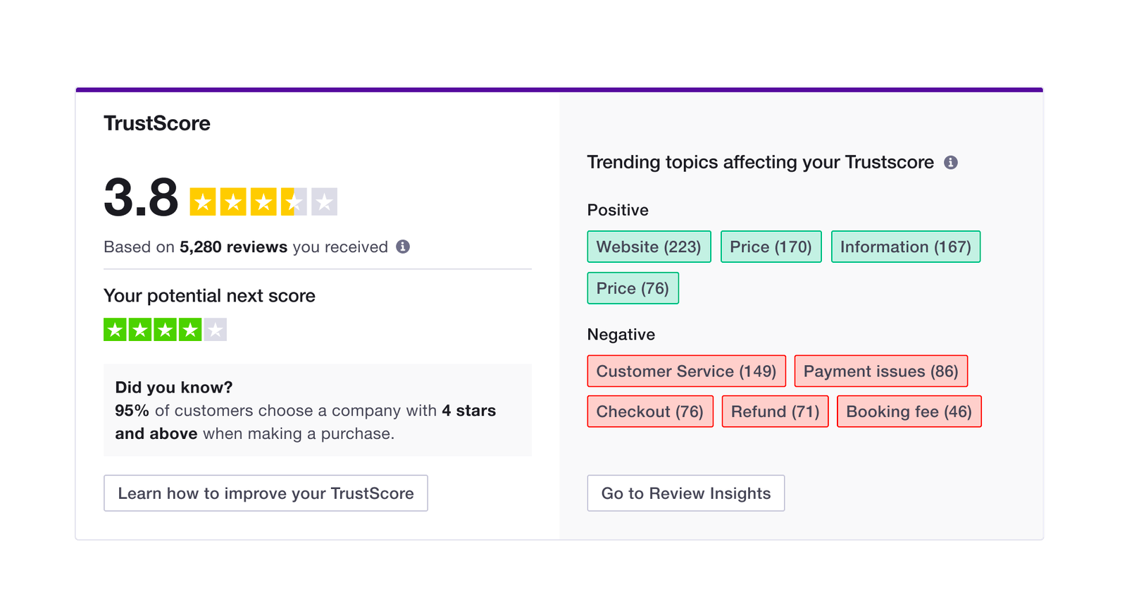
One of the first iteration of the main component of the page
I iterated on the page based on internal testing so we went from the UI above to this
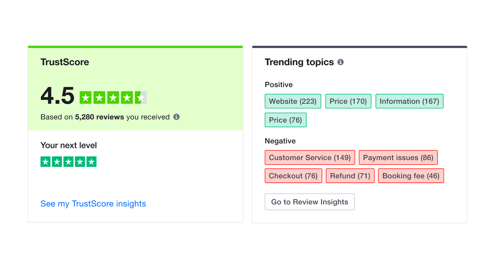
Next iteration of the main component of the page
and then after some more internal test sessions...

Next iteration of the TrustScore page
At this point, we were ready to test the prototype with actual users. [Spoiler alert!] After testing this version with users, I had to reorganise how the information is displayed (re-grouped similar cards and reduced the amount of accent colours as this was confusing for some participants).
Usability testing
Super useful insights from users + Rapid prototyping = Magic ✨
Based on the insight from the first round of test, I iterated on the existing UI and got ready for another round of testing. This next round was more tasking as I had to synchronise content on the UI with the actual business data. I overcame this challenge by collaborating with the Product manager to get the actual data on a Google sheet doc and then used a Figma plugin to sync the data with the UI.
In this next round of test, having the actual business data had a huge impact on how the businesses interacted with the prototype. They could relate more with the data presented, asked real questions and also gave some great insights!
Here are some of the insights from this round of testing:
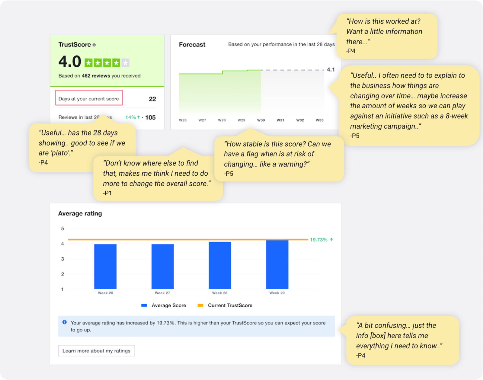
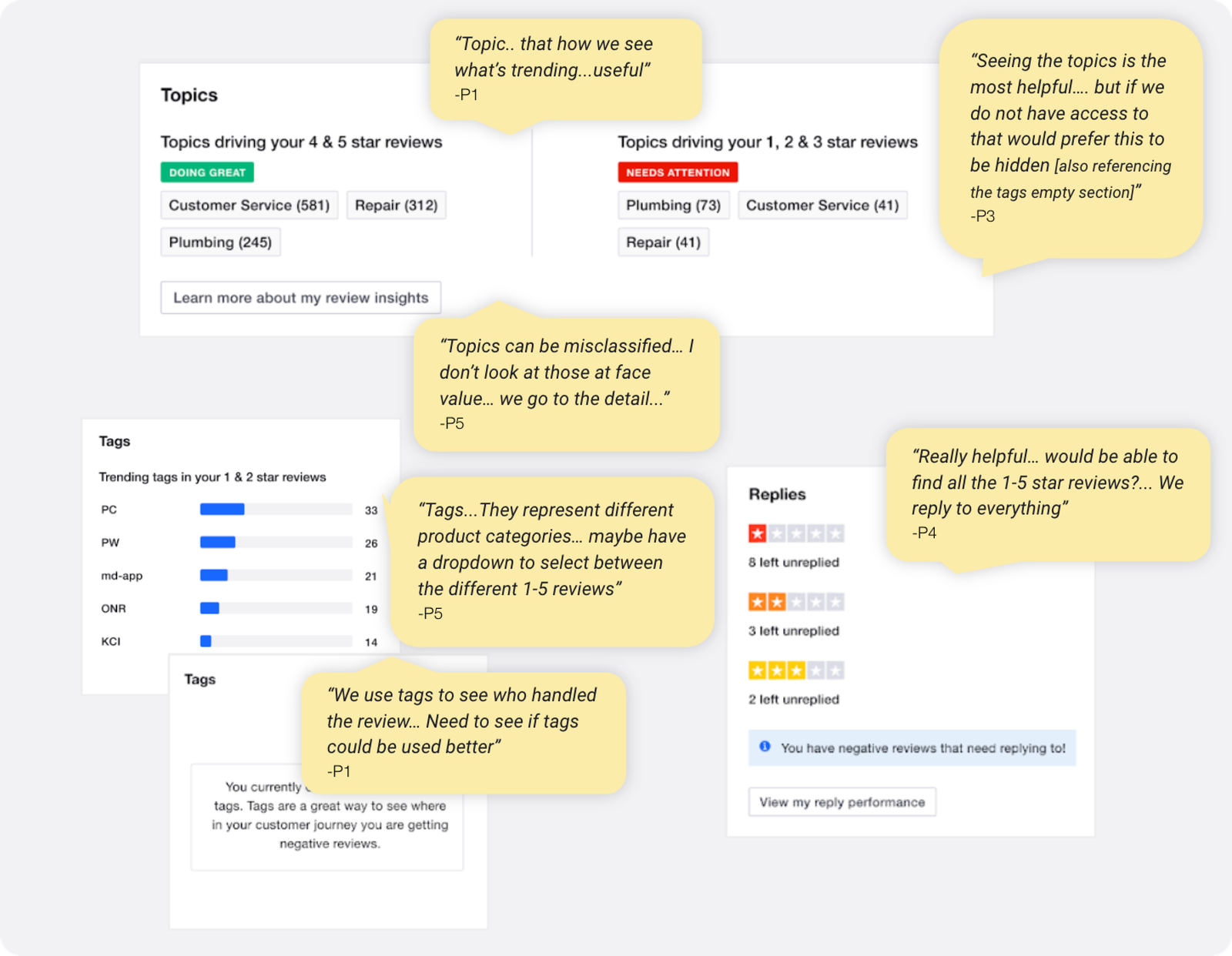
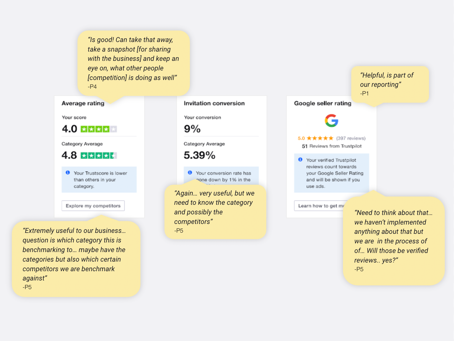
Some feedback from participants Credit: UX Researcher
Here's a quick overview of the usability test sessions with Trustpilot business users
5+
Prototypes/iterations
3
Usability test sessions
15
Participants
In all, the “TrustScore” card with “Days in current score”, the “Replies”, “Average rating (industry comparison)” and “Topics” sections were described as the most impactful.
“When is the team delivering this? Is this in production?...When are we going to have this? This is great!”

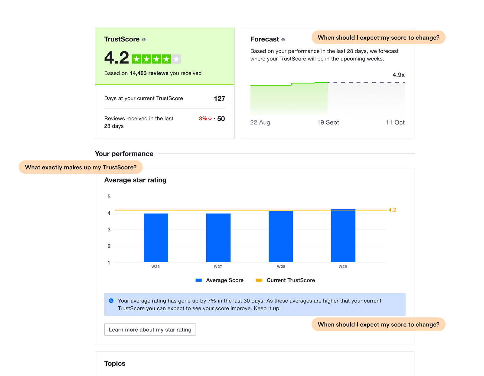
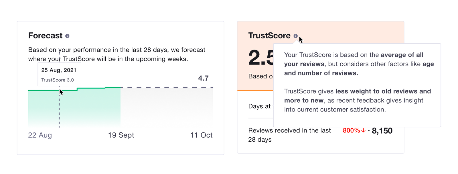
So rolling in the insights from the last test session, I made some other changes to the page. Some of the updates included adding tooltips to some of the cards to provide more context for users.

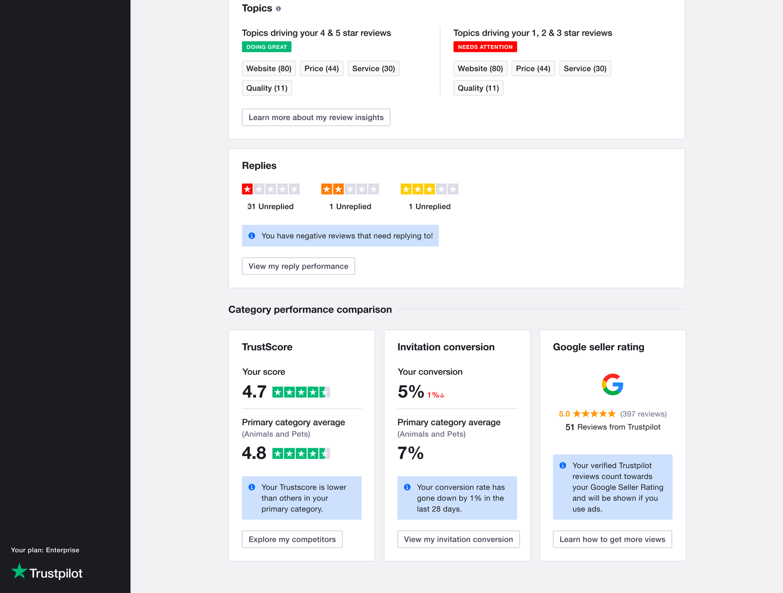
Next iteration of the TrustScore page
UX copy and Translations
Another key group of collaborators in this project were the UX writers, they helped to ensure the copy clearly communicated concepts and also that we align the tone of our copy with the Trustpilot writing guidelines.
One more thing to design for was translations. The TrustScore insights page would be available to business users from different locales so I had to design with translations in mind (which changed the sizing of some of the cards in the UI).
The TrustScore card adapted to different locales
Measuring impact and next steps
Apart from qualitative feedback received from businesses, here are a some quantitative metrics on the new TrustScore page since its launch.
From analytics we were able to validate the hypothesis that we will see an improvement in the reply rate to reviews (especially negative reviews). Also, a Hotjar survey showed that over 54% of respondents thought the page was useful. This also opened up questions on how improvements can be made to the page and overall expected behaviour of businesses on the page.
96.9k
Total Page views
30.1k
Unique Page views
110+
Businesses have loaded the page more than once
The new TrustScore page opened up a new opportunity to improve the experience of how businesses reply to and share reviews, these improvements were explored in another initiative by another team.
Key Learnings
☄️ Mooovee fast, learn, iterate!
During this project, I was able to get great value from rapid prototyping and testing. This helped the team discover incorrect assumptions we made in the designs/requirements quickly and also re-estimate the degree of impact the solution might have on our business users as well as learn more about their workflow.
Also, before the usability test session, I synchronized the data displayed in the prototype with the participants actual data. This allowed them to better understand what was displayed and follow the story we told on the page.
Another learning here is to try to leverage on real data during test sessions to provide users with a true picture of the concept being tested.