
Trivago
Helping people explore and find the best travel destinations 🏝
About
I joined trivago in 2020 and during my time there I worked on projects focusing on improving the experience of users of the trivago magazine which serves millions of people in over 10 locales. The goal was to help travelers make better decisions, guiding them down the travel funnel from exploring destinations to booking on the Hotel search side of trivago.
I worked in the marketing design team collaborating with 3 other UI/UX Designers.
Increasing click-through rate
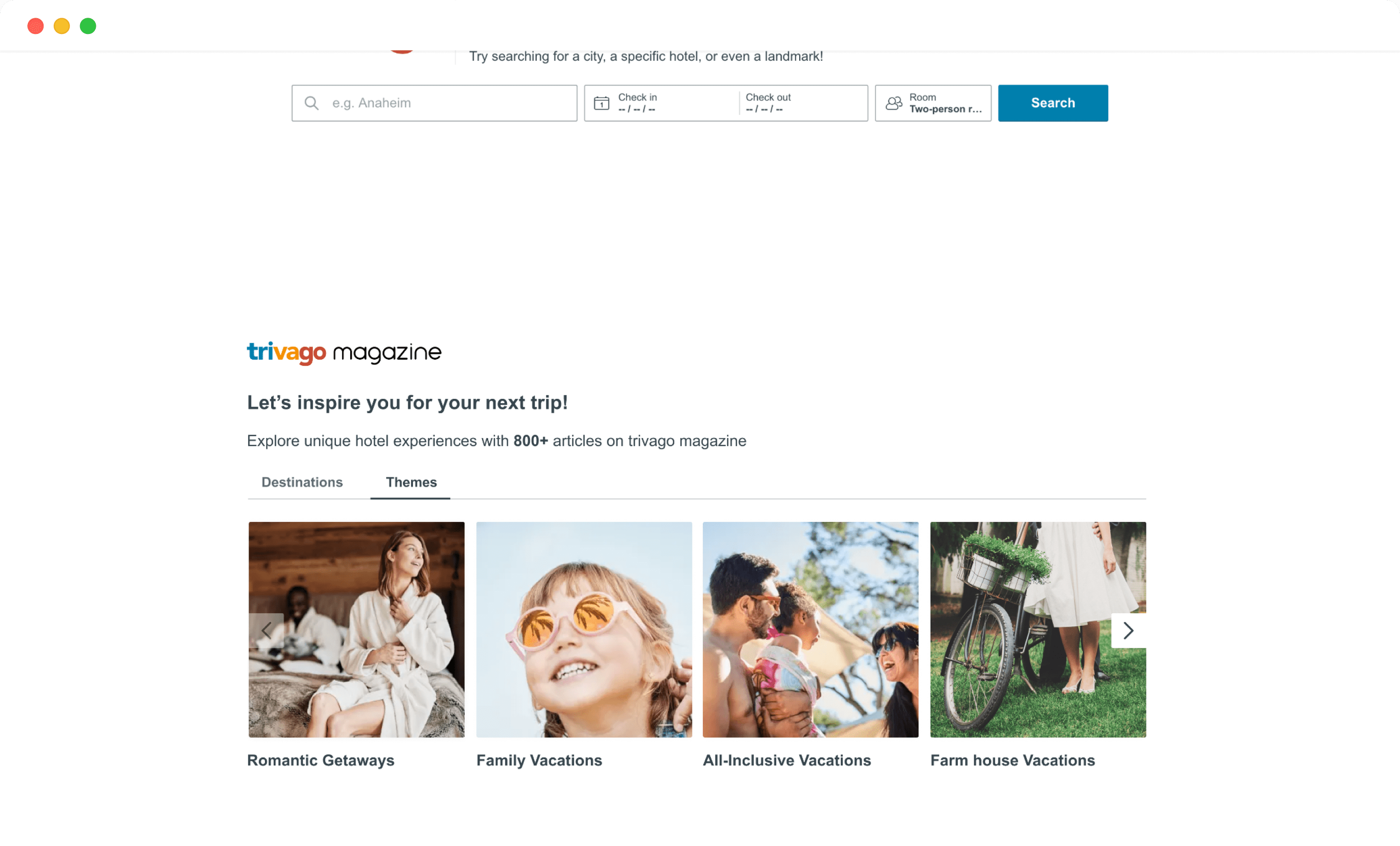
The landing page of trivago features a section which provides users with inspirational content relating to travel destinations. The goal was to help users make better travel decisions - providing travel inspiration for their next trip, experiences to look forward to, hotels available and their ratings.
The Challenge
Based on quantitative insights, 7% Traffic to the trivago magazine was from the trivago landing page (Hotel search). Hence, the challenge to increase the traffic to the magazine from the trivago landing page. To explore ideas on increase the click-through rate, the first task was to highlight limitations with the current design.
Limitations with the current implementation
Two main challenges were identified;
- The first is the limited article categories, only three categories are listed including a fourth category which leads users to the landing page of the magazine.
- Second is the absense of any visual cue to prompt users to click-through to the magazine.
Exploring solutions
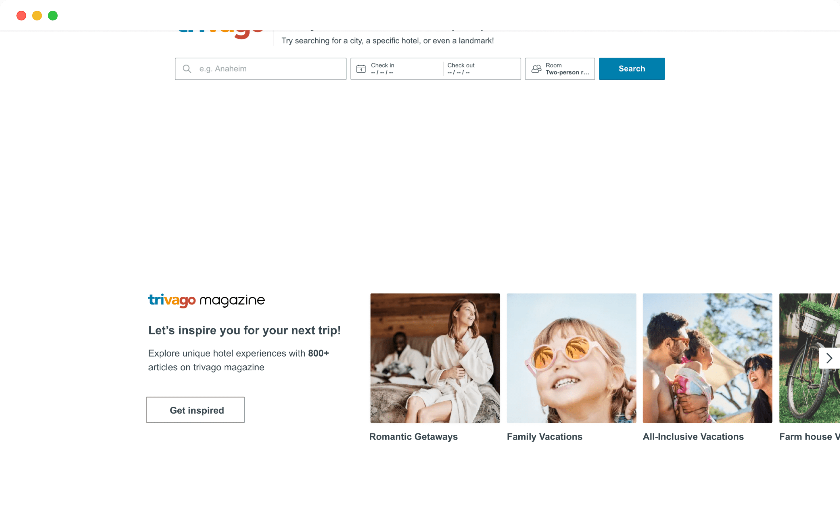
One of the ideas was to increase the number of articles (destination categories) listed on the landing page. This idea was visually represented using a carousel so that users can scroll through and see the diversity as well as the value of content on the magazine.
Ideas focused on increasing the content available on the landing page
The low fidelity designs above show the ideas I explored. Another idea to increase the click-through rate was to include a call to action to provide an entry point to the magazine's landing page.
Mockup of the first idea
To communicate the ideas to stakeholders, I created high-fidelity designs of the initial ideas. The first idea featured more articles in a carousel under tabs. I only made little adjustments to the copy of this section highlighting the number of articles available on the magazine.
Mockup of the second idea
The second idea seemed more aligned towards solving the challenges highlighted at the start as it not only featured more articles but also provided a clear call to action which leads users to the magazine.
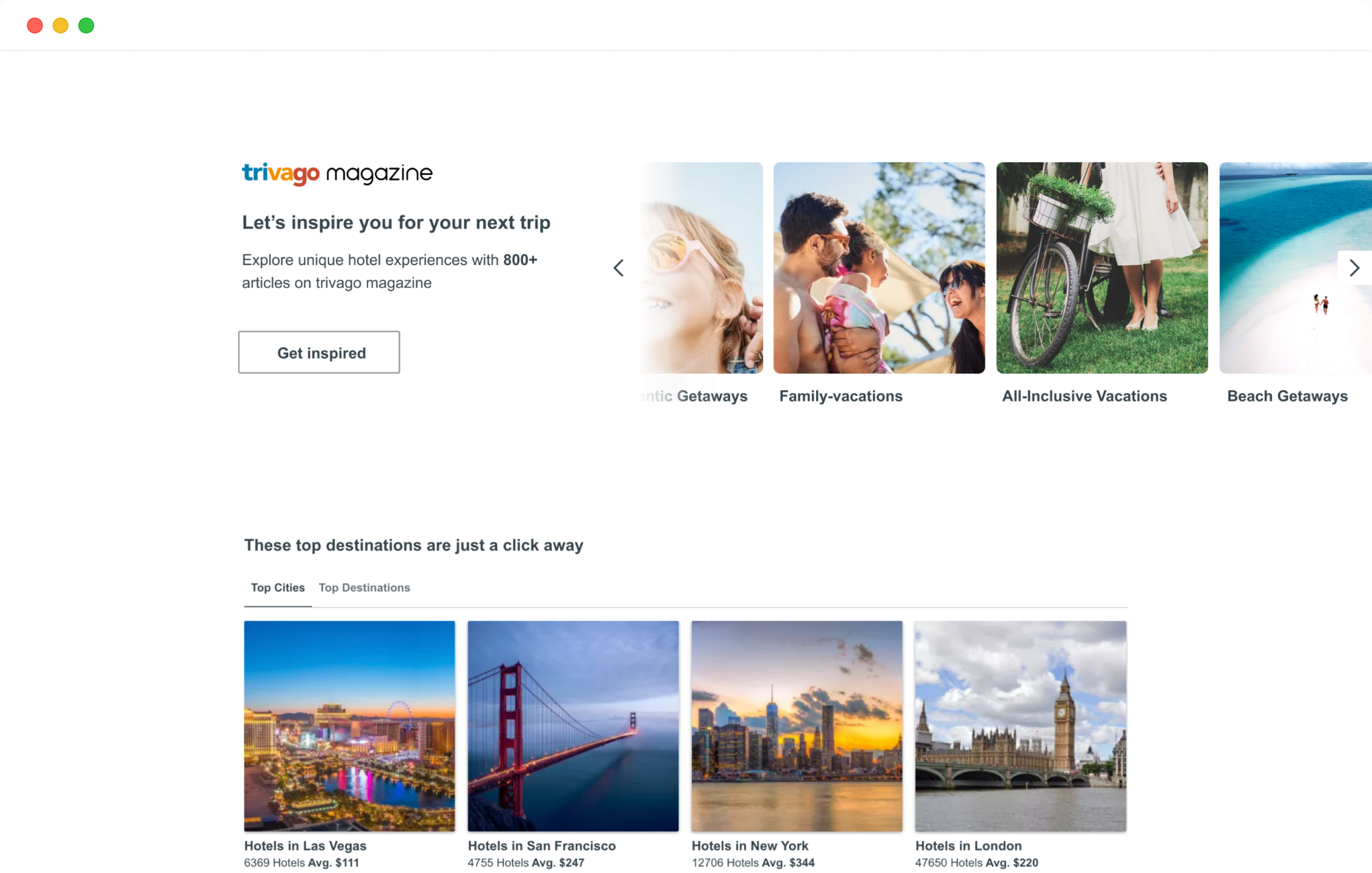
Mockup of the second idea (highlighting when a user scrolls the carousel)
Also, the second idea allowed for the section to stand out better as the first idea was really similar to the section after (the top destinations section) which I felt was a important in higlighting the magazine section on the landing page.
Improving the mobile experience
In my first weeks, I got to deep dive into insights from Google Analytics and Hotjar which are tools used to gather quantitative data about users of the magazine. I also collaborated with another designer to conduct a mobile UX audit of the entire trivago magazine and provided recommendations to the problems highlighted.
Insights from discovery

Heatmaps and session recordings show users are confused about navigation

Mobile has the highest percentage of users
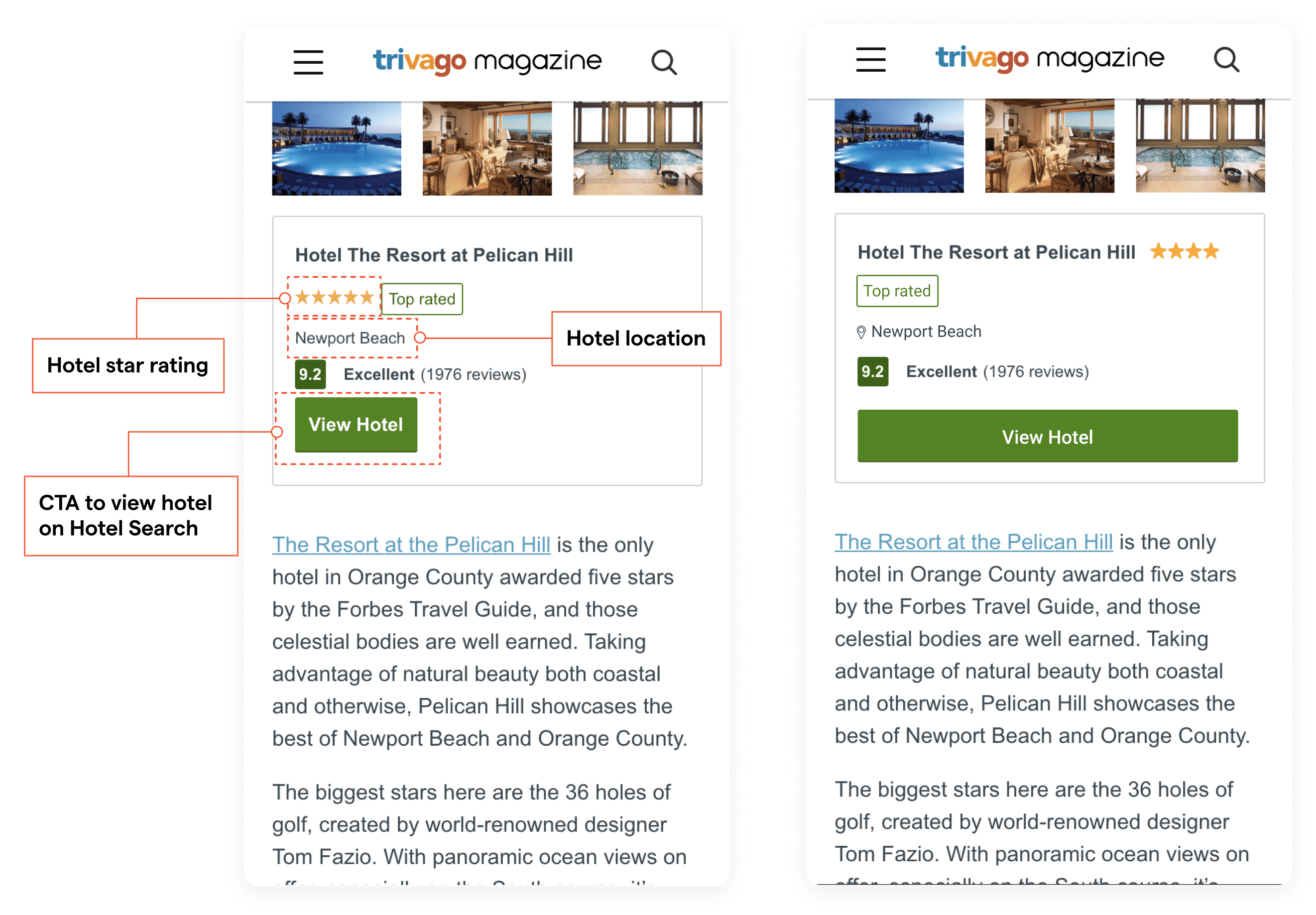
One of the first problems identified were issues with text accessbility. Low contrast between some text and the body background makes it difficult to read.
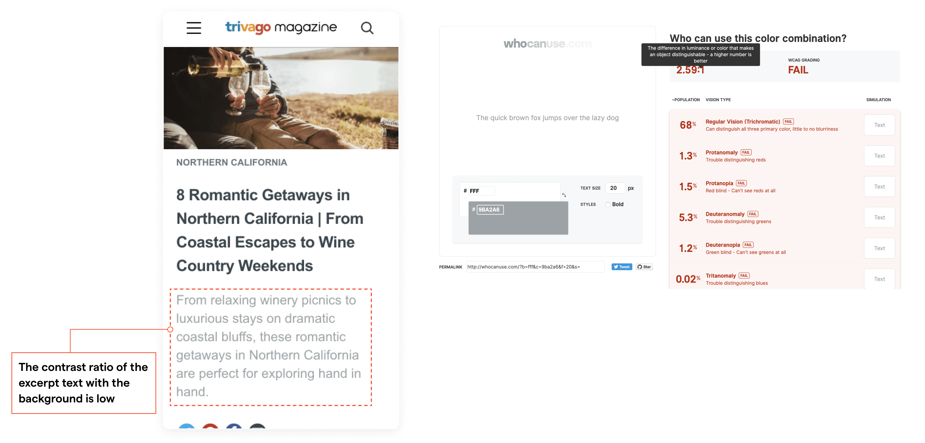
Accessibility issues uncovered
Next was the review section within articles. The organization of content in this section could be better structured and the CTA could be from end to end to accomodate users navigating with one hand.
Structure of the review section and the recommended changes
Another section that could be optimised is the gallery view showing recommended hotels within an article. It takes an average of three clicks to view, scroll and close the gallery modal.
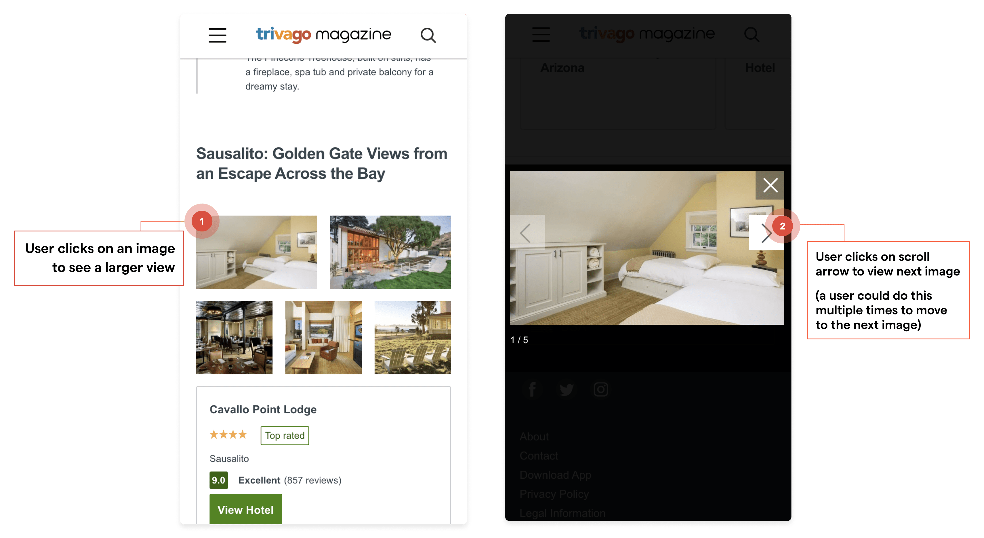
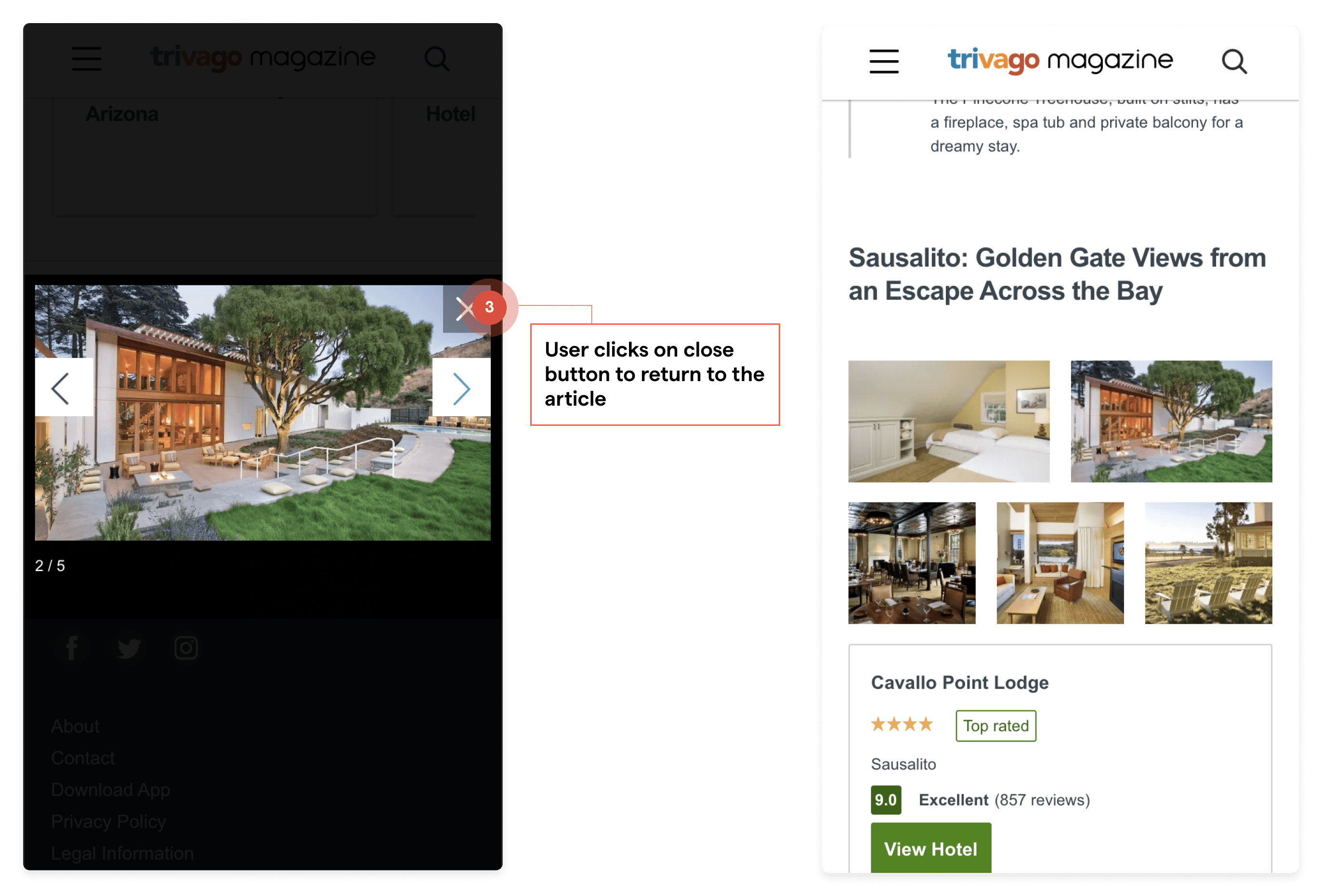
Viewing images in the gallery section
The proposed solution (illustrated below) optimises the number of clicks to view images. Also a count of images available is indicated thereby giving users more context.
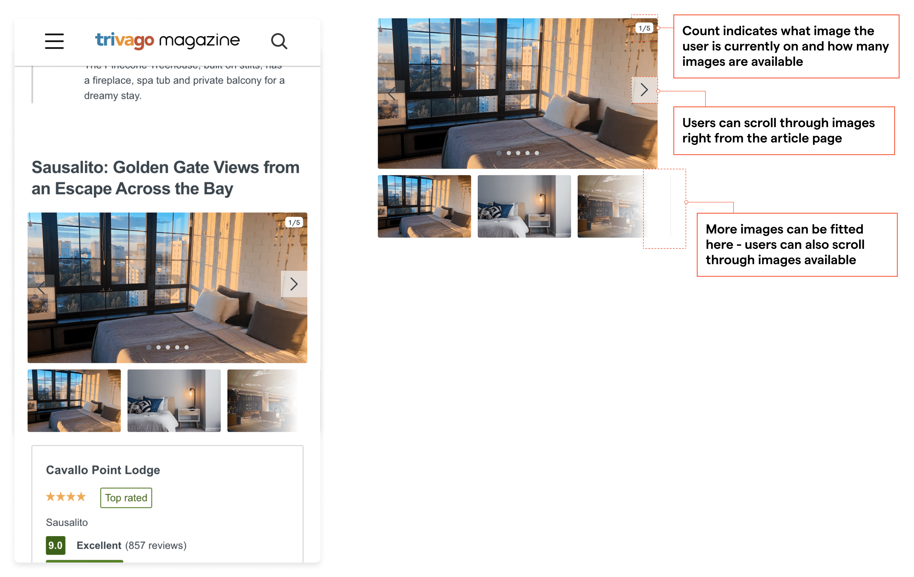
Proposed redesign of the gallery section
Improving the navigation
Research on how users interact with their mobile phones show certain areas are easy to reach hence, to solve the issue with navigating on mobile, the current navigation was evaluated against standard heatmap on how users interact with their device.
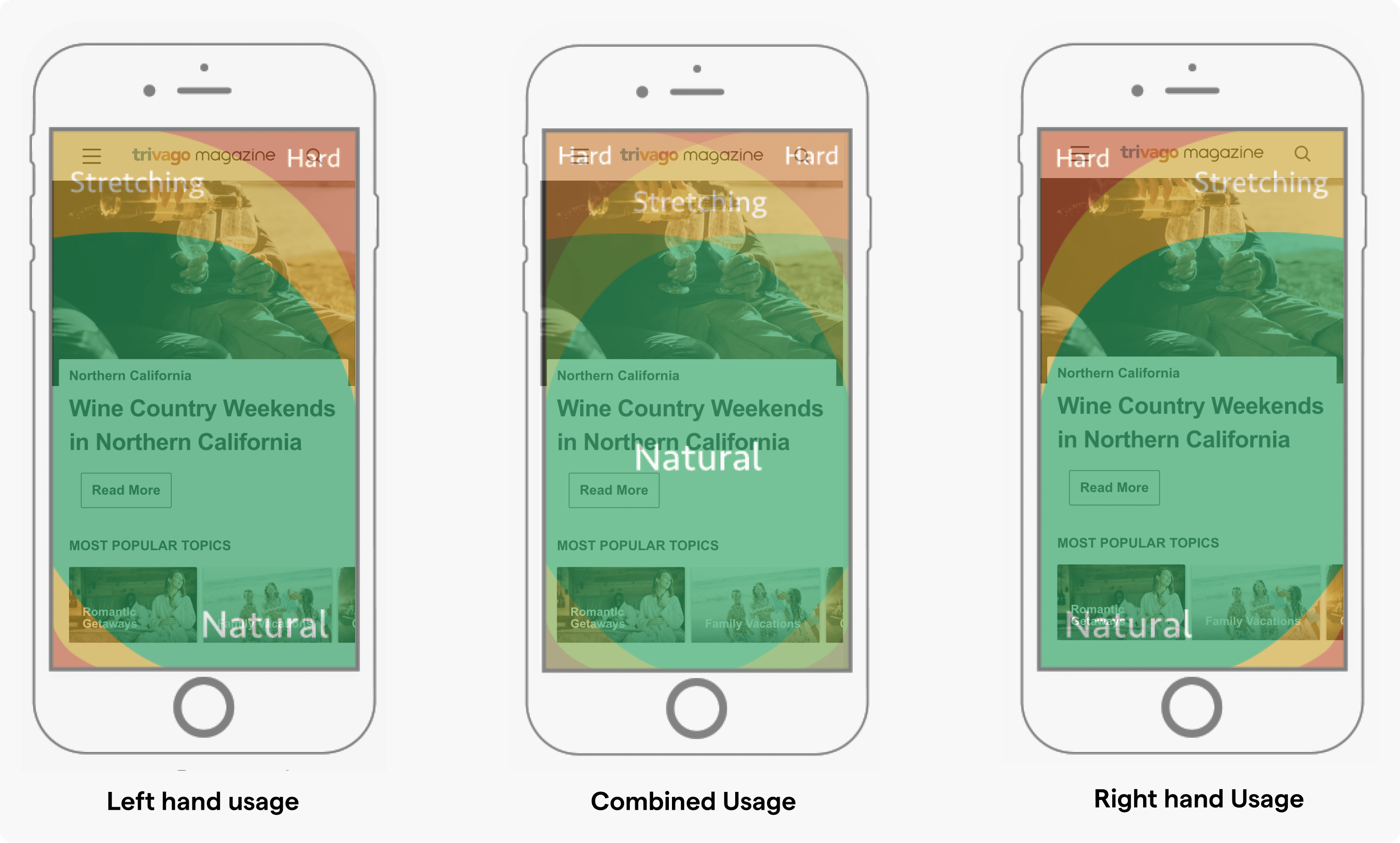
Benchmarking the navigation based on areas hard and natural to reach for users
Also, the number of steps to navigate or search for a destination was also evaluated. In the current implementation, it was quite complex to navigate to a destination.
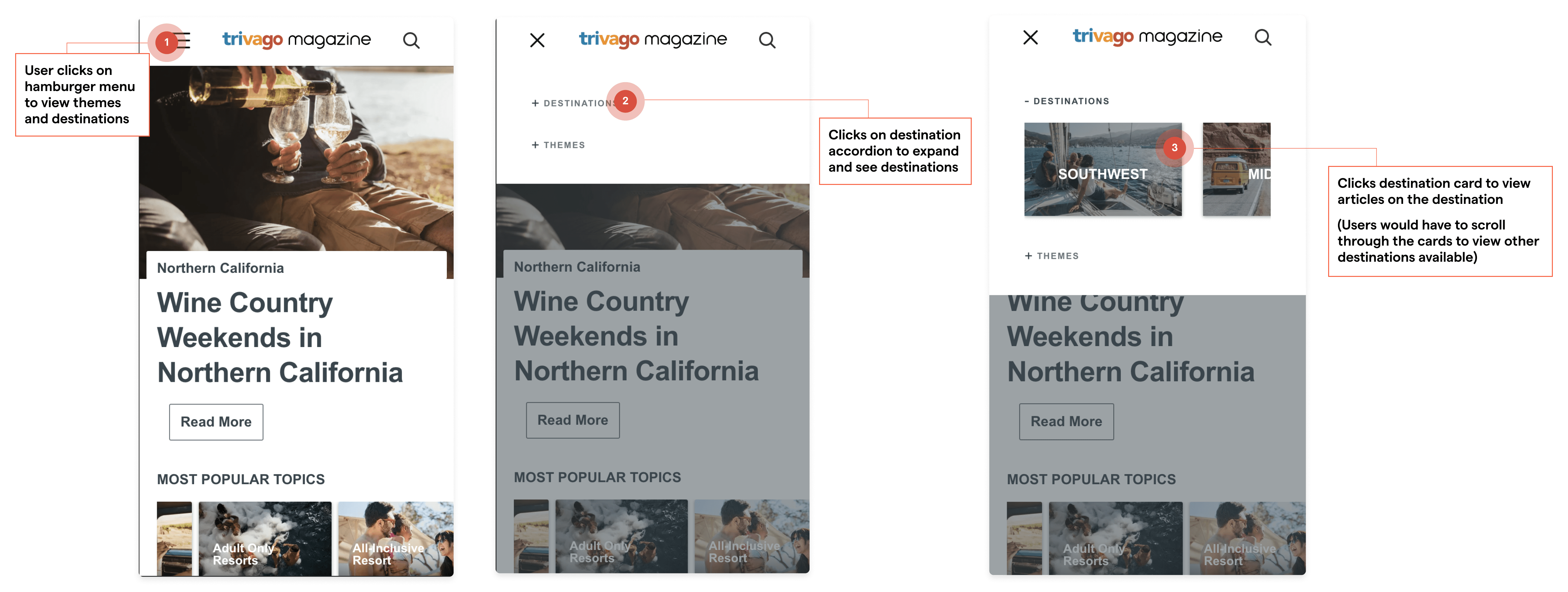
Navigating to a destination
One idea to fix the two issues highlighted above was to have navigational elements as tabs in the natural to reach area (visually represnted below).
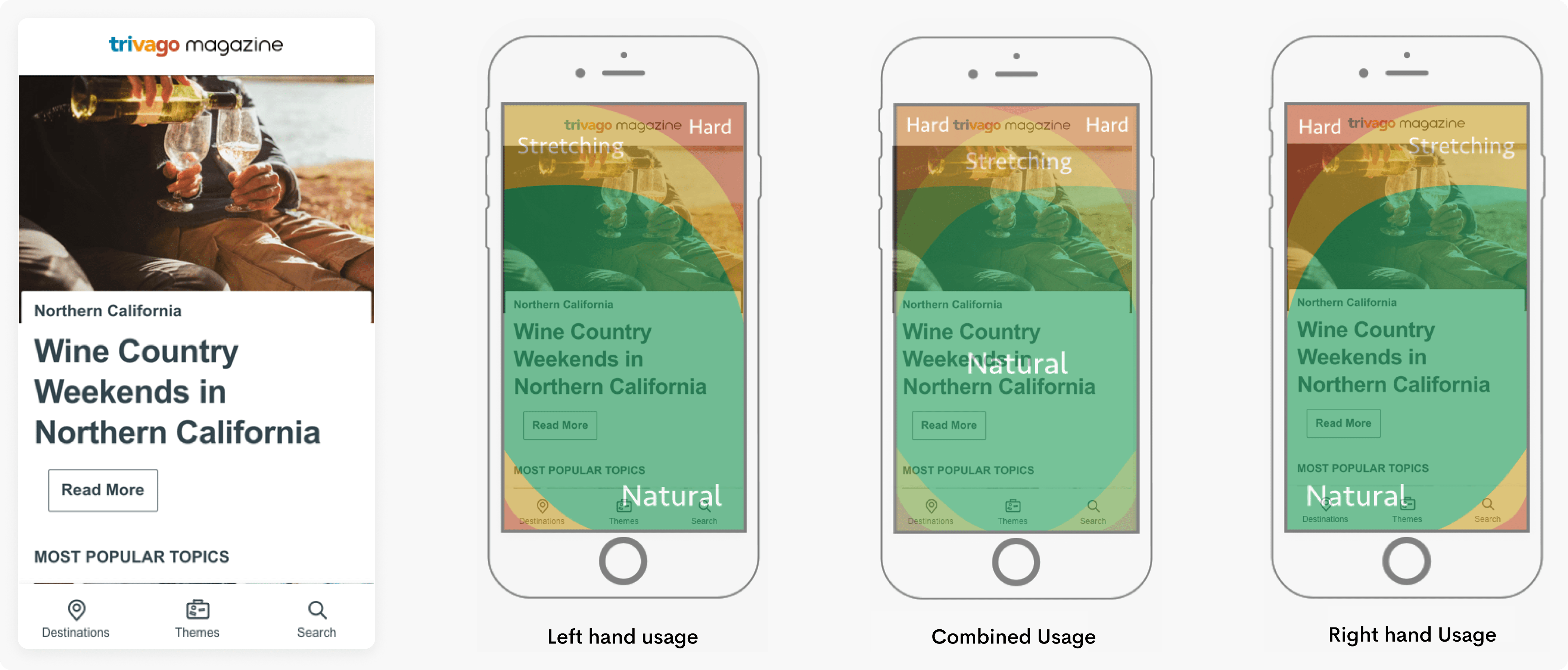
Redesign of the navigation focused on placing navigation in natural to reach areas
Presentations were made to the stakeholders to walk them through the ideas and get their feedback. Unfortunately major design and development changes were halted on the magazine before the proposed changes could be implemented.
Outcomes and Learnings
It was exciting to use insights from Google Analytics and Hotjar session recordings to understand how users navigated through the magazine. I also worked with other team members to plan and execute tests on usertesting.com when a new destination page/template was to be implemented.
I enjoyed working on the ux audits and ideation sessions as they helped me gain a good grasp of how the magazine operates at the top of the travel funnel moving users down from explorative travelling to eventually booking a hotel on trivago.